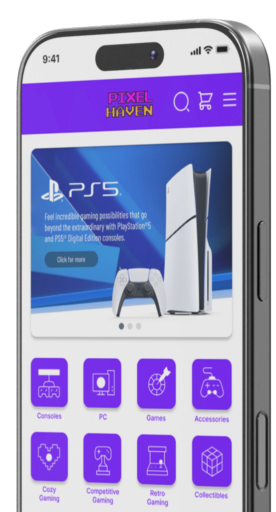
Pixel Haven is an eCommerce app that enables gamers to purchase gaming equipment.
E-commerce websites catered towards gamers are often not specialized, but they are a section of a bigger website selling electronics.
2 months
To create a seamless shopping experience catered specifically for gamers with an intuitive and user-friendly interface.
This was an individual project that allowed me to plan and execute each step in the design thinking process.
To create a seamless shopping experience catered specifically for gamers with an intuitive and user-friendly interface.
The objective of my user research was to understand the user needs, shopping behaviors and pain points in order to create an app that improves user experience and overall engagement.
I conducted a quantitative research by surveying gamers of a Facebook group to understand their experiences purchasing gaming equipments in the most popular e-commerce websites for electronics in Hungary.
Many users found challenging to browse due to cluttered layouts and unclear menus.
Users felt that in some cases products have no detailed specifications, high-quality images.
Users expressed dissatisfaction with the limited or poorly structured product categories.
Users heavily rely on customer reviews and ratings to determine the quality and reliability of a product.
This journey map simulates Alex’s path to purchase a gaming mouse. It captures the tasks he needs to complete along with his feelings and potential improvement opportunities.
This user flow demonstrates the steps the user goes through to complete their goal. This served as a guide when creating the wireframes.
First wireframes were created by pen and paper, focusing on the user journey to purchase a product.
Paper wireframes were further refined using Figma. Similarly as in case of the paper wireframes, main screens in focus were the ones demonstrating the steps till the completion of purchase.
While creating the low-fidelity prototype I was focusing on the main interactions happening on each screen.
Unmoderated study
Hungary, remote
10 participants
15-20 min
Testers highlighted that there is no option to increase the number of products before adding to the cart.
Testers didn’t have the option to remove a product from the cart, or increase the number of products
Users appreciated the wide selection of categories to choose from at the home screen
Findings of the usability study were taken into consideration, and when creating mock ups, added the missing features highlighted by the testers.
When creating the high fidelity prototype the focus is following the user journey from the beginning till the end of a product purchase.
There is only one typeface used in the entire design making readability easier.
Text hierarchy makes it easier for users to distinguish the different sections and information on screen.
When creating the UI design I aimed to use colors that comply with WCAG rules to make readability easier.
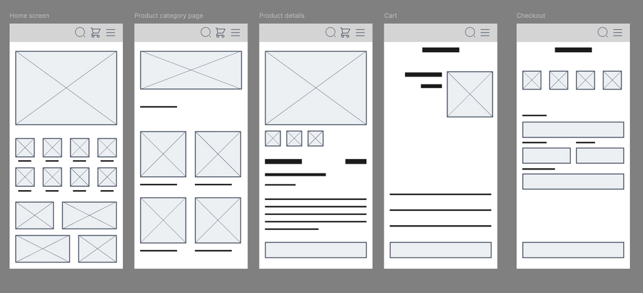
The impression of the testers was positive about the features and functions of the app. They felt seen, and appreciated the various categories implemented on the home screen of the app. They had an overall positive experience while testing the application.
The usability study highlighted features that I would not have thought from my own, so I am thankful to all the participants testing my design. Accessibility features should never be an afterthought and in this area I have much to improve.